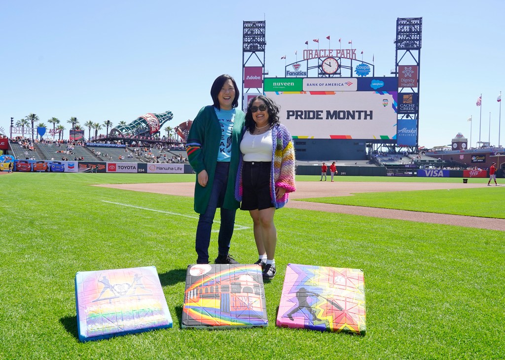
I was selected by the San José Sharks to create a logo and patch for their Pride Night on March 18, 2023 which featured these designs on the players’ warm up jerseys. My approach to this design was to go simple. Simple and easy enough that a child could understand that this logo represents love. LOVE.
The meaning behind the main logo:
The shark in the middle is the representation of the trans community as it is depicted in the colors of the transgender flag.
The hockey sticks have the progressive LGBTQIA+ tape at the bottom and love written on the grips on the top to represent how the LGBTQIA+ community loves and uplifts each other. The hockey sticks are under the shark cradling it to show that the community is hugging and lifting up our trans community to give them strength and support.
The heart in the back represents San José Sharks and the City of San José holding space, love, and support for the LGBTQIA+ community.
The crest as a whole represents love, acceptance, and safe spaces for LGBTQIA+ people and communities by having big voices like San José Sharks showcase Pride at games to show LGBTQIA+ representation and support to our local LGBTQIA+ organizations.
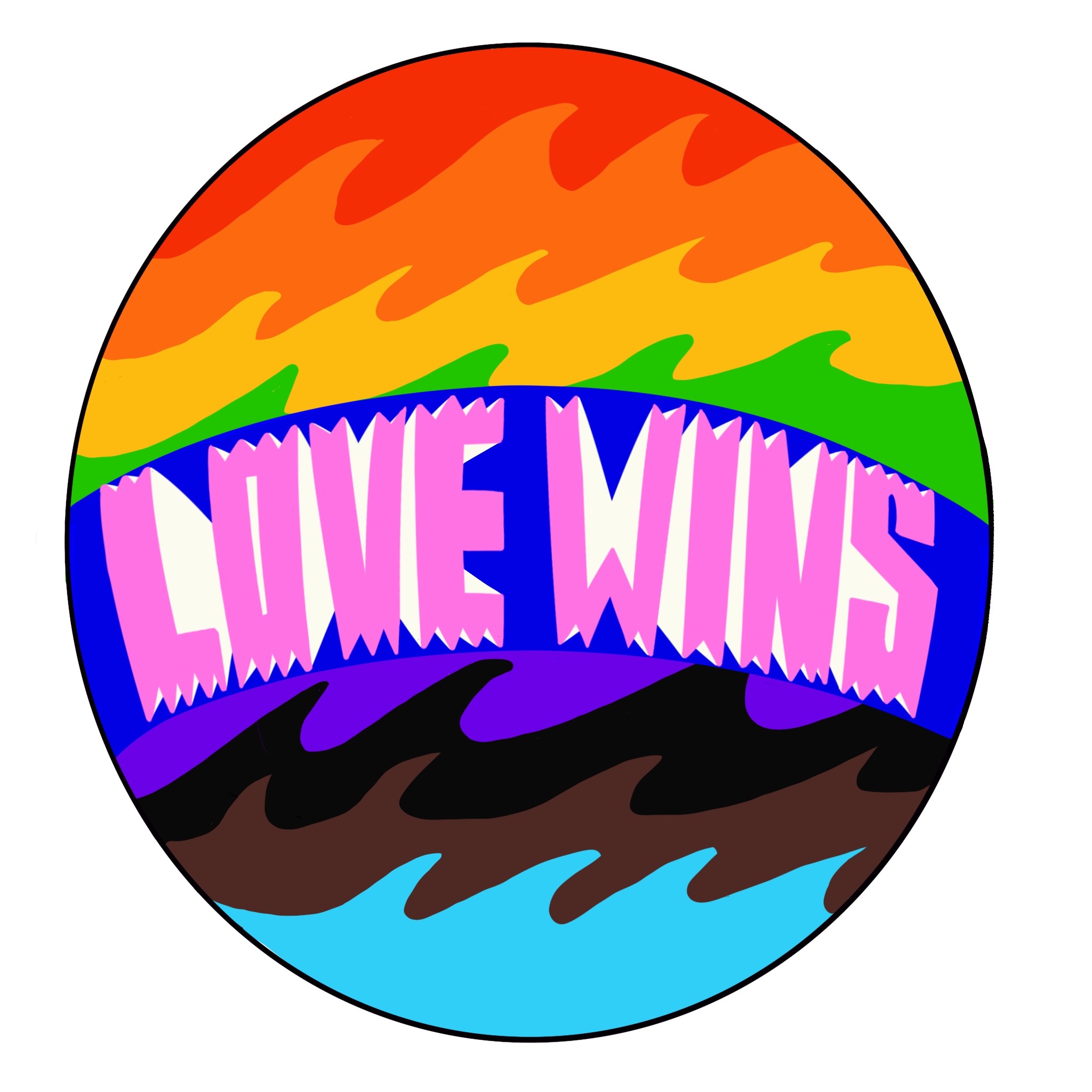
The meaning behind the Love Wins patch:
Love wins lettering was inspired by the San José Sharks 1990 word-mark logo. The waves in the back are in the colors of the progressive LGBTQIA+ flag. The water is meant to illustrate the movement towards safety for LGBTQIA+ communities.
I would like to express my deep gratitude to Local Color for connecting me to the San José Sharks, the San José Earthquakes for recommending me to Local Color, and the San José Sharks for selecting me to honor our LGBTQIA+ community.
Pride Mural Presented by San José Earthquakes and Adobe
Pride Mural Presented by San José Earthquakes and Adobe 2022. Temporary Mural located at PayPal Park 1123 Coleman Ave, San José, CA 95110
The San José Earthquakes and Adobe asked me to create a mural with the theme of “What does Pride mean to you?” I created the design to represent a flower arch to show how our queer ancestors fought for love equality. The signs represent how far we have come, but also the fight that we must continue to protect trans youth and adults. The soccer balls represent different LGBTQIA+ flags and the flowers are the colors of the progressive flag. My partner and I are in the middle to show our respects to our queer ancestors and to celebrate our love out loud. My partner is sporting the San José Earthquakes’ jersey to pin our location to my hometown of San José, CA.
A special thanks to the San José Earthquakes and Adobe for selecting me for this beautiful project and for giving me full artistic freedom throughout the creation of the mural. Another special thanks to Decca Design and San José Stage for taking care of me during the process of the mural.
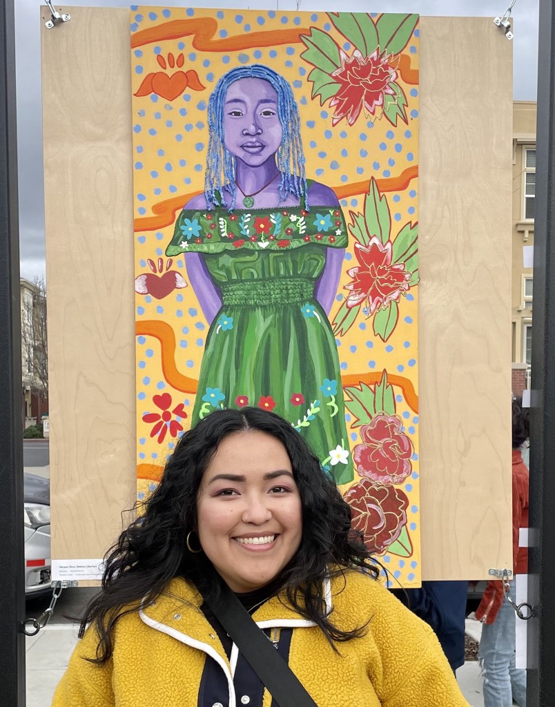
Qmunity District Mural
I was one of two artists selected to represent the LGBTQIA+ community in the South Bay for Qmunity District, the newest LGBTQIA+ district in downtown San José . I designed and painted this section of the wall that depicts actual LGBTQIA+ residents living in the area.
A special thanks to Project More, the Qmunity District Mural Committee and the City of San José .
Watch the mural unveiling and read press about the project below:


You must be logged in to post a comment.